February - July 1968
Designing the Apple Records logo
Last updated on December 1, 2024
February - July 1968
Last updated on December 1, 2024
Article Jan 29, 1968 • Paul McCartney and Peter Asher visit the Press Association photo archive
Article Jan 30, 1968 • Cilla Black's television series "Cilla" launched in the UK
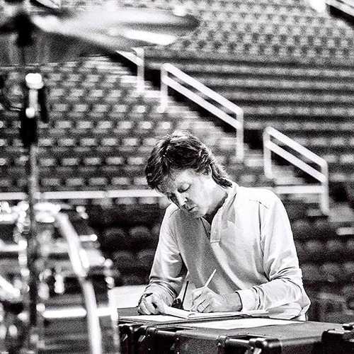
Article February - July 1968 • Designing the Apple Records logo
Article February 1968 • Ringo Starr photographs Paul and Jane
Article Feb 02, 1968 • Paul McCartney completes "Step Inside Love" for Cilla Black
The Beatles hire Alexis “Magic Alex” Mardas
Aug 24, 1967
Apple Corps open offices in London
Jan 22, 1968
Mar 29, 1968
Paul McCartney meets American scriptwriter Francie Schwartz
April or May 1968
Apple publishes an ad to find new talent
Apr 19, 1968
Paul and John meet Ron Kass in New York
May 12, 1968
The Beatles promote Apple Corps in New York
May 14, 1968
Paul and John fly from New York to London
May 15, 1968
The Apple shop mural is being removed
May 15-18, 1968
May 23, 1968
Paul McCartney celebrates his 26th birthday
Jun 18, 1968
Apple Corps was established in January 1968, encompassing a network of companies, including Apple Records Ltd. While a corporate logo for Apple Corps had been created, a distinct logo for the new record company was still needed.
Apple Corps director Neil Aspinall reached out to graphic designer Gene Mahon, who had previously designed the back sleeve of The Beatles’ “Sgt. Pepper’s Lonely Hearts Club Band” album in 1967.
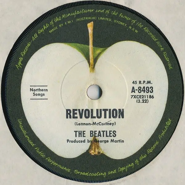
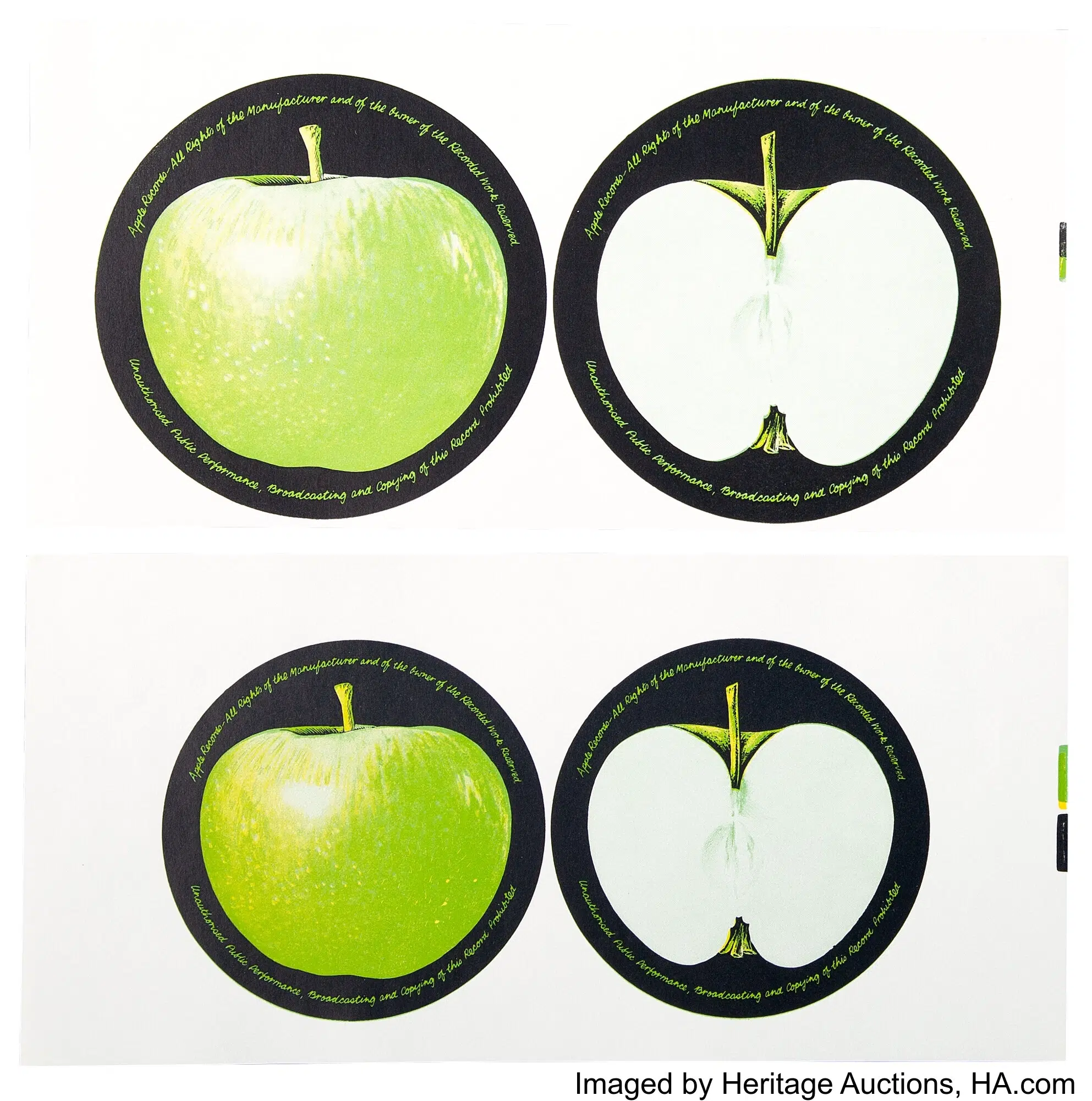
For the vinyl releases by Apple, Gene Mahon proposed the concept of featuring a Granny Smith apple on the A-Side and a sliced apple on the B-Side. This concept took nearly six months to evolve into a final design that met the approval of everyone at Apple, including The Beatles.
The inaugural records showcasing the Apple logo on both sides were released on August 11, 1968, as follows:
| Single | UK Reference | UK release date |
| “Hey Jude / Revolution” by The Beatles | R 5722 | August 31, 1968 |
| “Those Were The Days / Turn, Turn, Turn” by Mary Hopkin | APPLE 2 | August 30, 1968 |
| “Sour Milk Sea / The Eagle Laughs at You”, by Jackie Lomax | APPLE 3 | August 26, 1968 |
| “Thingumybob / Yellow Submarine” by Black Dyke Mills Band | APPLE 4 | August 31, 1968 |
During this period, the vibrant green, yellow, and orange Apple Corps logo was replaced with a simpler design featuring the Granny Smith apple. Whether Gene Mahon also crafted this new corporate logo remains uncertain.
The name “Apple” was suggested by Paul McCartney, who was inspired by “Le Jeu de Mourre“, a painting by René Magritte that he acquired through art dealer Robert Fraser. The new Granny Smith Apple logo was a distinct homage to “Le Jeu de Mourre.”
Designing the Apple label was a relatively straightforward job. What I brought to it was the idea that it can stand as a pure symbol. Let it never have any type on, put all that on the other side of the record — just designer stuff really. And the apple that had the information on it should be sliced, to give a light surface on which to put type… I said to McCartney, ‘It’s a green apple, a big Granny Smith’ and he said, ‘Oh, good!’
Gene Mahon – From “Paul McCartney: Many Years from Now” by Barry Miles, 1997
When Gene Mahon returned to the advertising agency from lunch that afternoon, there was a note asking him to call Neil Aspinall at Hunter 1931. […] When he got through, Neil asked him to come over to 95 Wigmore Street as soon as possible. It was February 1968. […] When Gene Mahon arrived at 95 Wigmore Street, Neil was there with Mal Evans, another top Apple executive.
Neil told Gene that he wanted a photograph of an apple for a record label. Well, that seemed simple enough. Suddenly on the pickup — in that one instant — his flash came to him! It was one of those illuminating rushes in which the entire design universe opened up. “Listen,” he said, “why don’t we have the A-side of the record as a completely whole apple with no writing on it whatsoever. On the B-side, we can have an apple sliced in half with all the label copy. To avoid any confusion as to what is on which side, we’ll write on the left-hand side of the sliced apple, This Side, and then give the song title, artist’s name, running time, publishing, etc. Now on the other side of the sliced apple, put Other Side with the title and the copy for the A-side.”
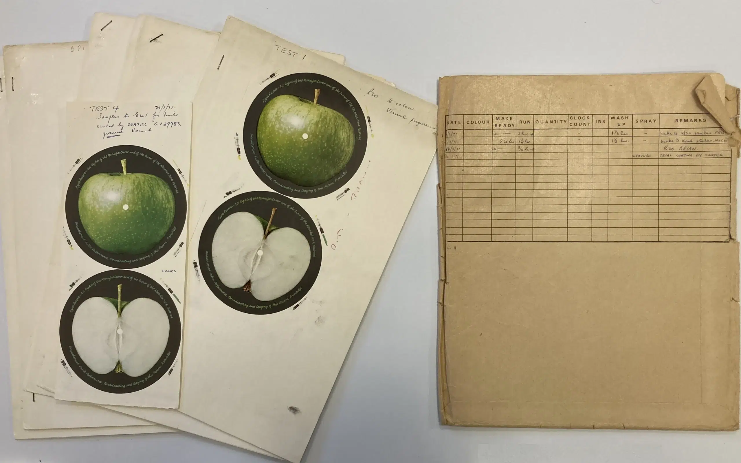
It was the ultimate Acid-Purist design concept for a record label. Neil and Mal looked at him and nodded silently. The next day, Gene went to a photographer named Paul Castell and asked him to take photographs of apples: a red apple and a green apple, a whole apple and a sliced apple, against a variety of colored backgrounds. Two days later, Paul Castell returned with an assortment of apples on black, red, blue, green, and yellow backgrounds, shot on 2-¼ inch transparencies.
The days melted into weeks. March became April.
Paul McCartney was the Beatle who was lavishing his days and energies on the newborn baby Apple, trying to work out the definitive Apple with Gene. When Gene had delivered the transparencies to Neil, he told him, “These two are the ones I recommend and here are some others for you to consider.”
The transparencies were masked in an oval so that when projected on a viewing screen they would resemble a record. Then masses of color prints were made. Six every time. There were four Beatles, one managing director, and the divisional head of Apple Records, Ron Kass. All six had to know at all times what the other five were seeing. Gene Mahon still gently insisted that the best-looking label would be the one he had initially suggested with the virgin apple face. Further weeks of deliberation followed. […]
Gene Mahon’s concept of a clean, unadorned apple was on a collision course with the legal requirements which bind a record company to state the contents clearly on both sides of a disc. The A-side of the whole apple would have to have the appropriate dialogue on it. Ditto for the B-side.
It was a shiny green Granny Smith apple on a black background that was finally chosen as the definitive Apple apple — a great moment in the history of the fruit and record industries.
From London, the artwork was sent to New York where the dye transfers were made up from which the label would be master-printed. When it was returned to London for the final touches, it was handed over to another young and talented designer, Alan Aldridge, for the completion of the copyright lettering that skirts the perimeter of the record.
The entire project had taken six months from conception to completion. The Apple record label had been born.
From “The Longest Cocktail Party: An Insider Account of The Beatles & the Wild Rise and Fall of Their Multi-Million Dollar Apple Empire” by Richard DiLello, 2014


Some hippie designers were brought in and they came up with artwork depicting an old-fashioned variety of Cox’s orange pippin, all rosy red, green and yellow, which everyone loved because it was so friendly and nice, the kind of apple you’d find stuffed into your Christmas stocking. Initially, this logo was used on things for the Apple shop and for the notepaper. It was all very relaxed and harmonious but apparently not very businesslike.
Tony Bramwell – From “Magical Mystery Tours: My Life with the Beatles“, 2005

The Beatles Diary Volume 1: The Beatles Years
"With greatly expanded text, this is the most revealing and frank personal 30-year chronicle of the group ever written. Insider Barry Miles covers the Beatles story from childhood to the break-up of the group."
We owe a lot to Barry Miles for the creation of those pages, but you really have to buy this book to get all the details - a day to day chronology of what happened to the four Beatles during the Beatles years!

Notice any inaccuracies on this page? Have additional insights or ideas for new content? Or just want to share your thoughts? We value your feedback! Please use the form below to get in touch with us.